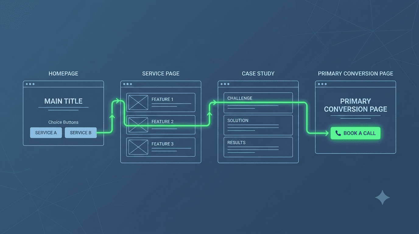
The Scattered Website
Your website has 12 pages: Home, About, Services, Portfolio, Blog, Contact, Team, Testimonials, FAQs, and more. Each page has its own little call-to-action (CTA)—"Learn More," "Contact Us," "Read More," "Get a Quote." Your visitors land on different pages from different sources and scatter in 12 directions. Very few take the action you actually want them to take: contact you for a consultation.
This is the "Every Page Is a Landing Page" mistake. It assumes visitors will explore your site like a museum. They won't. They need a clear, guided funnel that pulls them toward one high-value conversion point. Here's how to architect that funnel.
The "One Primary Conversion Goal" Principle
Identify the single most valuable action a visitor can take on your site. For most Kenyan professional services, it's "Book a Consultation" or "Request a Quote." Every page on your site should be subtly designed to guide visitors toward that action. No competing CTAs.
The Funnel Architecture
1. The Homepage: The Broad Net
Your homepage serves two purposes: (a) instantly convey who you help and how, and (b) segment visitors into clear paths. A simple choice: "I'm a Business Owner" / "I'm a Procurement Officer" / "I'm an Individual." Each choice leads to a tailored page that funnels them toward the primary CTA.
2. Service Pages: The Specific Hook
Each service page is a deep dive into a specific problem and solution. At the bottom, a single, contextual CTA: "Ready to solve your [specific problem]? Book a free 20-minute diagnostic call." Not "Contact Us for All Your Needs." Specificity converts.
3. Blog Posts: The Soft Funnel
Blog posts attract top-of-funnel traffic. They should not end with "Subscribe to our newsletter." They should end with a content-relevant CTA: "Want help implementing this strategy for your business? Talk to us." The post itself is the pre-sale. The CTA is the close.
4. Portfolio & Case Studies: The Proof Funnel
Each case study should end with: "Want similar results? Let's discuss your project."
5. The Primary Conversion Page: The Destination
All paths lead here. This is a dedicated, high-converting page (the "Landing Pad" we've described in Article 50) with only ONE action. No navigation menu, no footer links—just the CTA and supporting trust elements.
The Menu as a Funnel, Not a Directory
Your navigation menu should have no more than 5-6 items. The last item should be a prominent, visually distinct button: "Book a Call" or "Get Started." This is the funnel's exit—the action you want everyone to take.
The Result
When a Stonehenge Digital client restructured their site from a "scattered museum" to a "guided funnel," their overall website conversion rate (visitor to enquiry) increased from 1.2% to 4.8%. Same traffic, same services, dramatically better results.
Your website is not a brochure. It's a sales funnel. Design it accordingly.
Interested in Portfolio & Organisational Website?
Let's build this for your business
A professional, mobile-first website that makes your business look credible and gets found on Google.