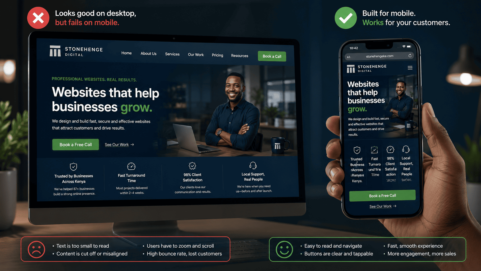
You Built It for the Wrong Screen
You designed your website on a large desktop monitor. It looks beautiful—on a desktop. But here's the problem: over 70% of your Kenyan visitors are viewing it on a smartphone. And on that small screen, your "beautiful" site is a squished, frustrating mess.
Text is tiny. Buttons are too small to tap. The menu doesn't expand properly. Images take forever to load on 3G. Your visitor, already impatient, leaves in seconds. This is the mobile-first imperative: if your site isn't designed primarily for phones, you're invisible to the majority of your market.
What "Mobile-First" Really Means
It's not just about making your desktop site "responsive" as an afterthought. It means starting the design process from the mobile screen and then scaling up. It means prioritising the mobile user experience in every decision.
4 Common Mobile Mistakes (And How to Fix Them)
1. Tiny Tap Targets
Buttons and links must be at least 44x44 pixels (about the size of a fingertip). If a "Buy Now" button is small and surrounded by other elements, users will mis-tap and leave frustrated.
2. Slow Load Times on 3G
Optimise images to WebP format, minimise code, and use a mobile-friendly hosting setup. A site that takes more than 5 seconds to load on a 3G connection is a site that gets abandoned.
3. Text Too Small to Read
Users shouldn't have to pinch and zoom to read your content. Use a base font size of at least 16px, and ensure line spacing is comfortable on small screens.
4. Interstitials and Pop-ups That Block Content
Large pop-ups that cover the screen and are hard to close are a mobile UX nightmare. Use them sparingly, if at all.
The Business Case for Mobile-First
Google's algorithm now uses mobile-first indexing—it ranks your site based on the mobile version. If your mobile experience is poor, your Google ranking suffers. More importantly, a mobile-friendly site simply converts better. A Stonehenge Digital client saw a 45% increase in mobile enquiries after a mobile-first redesign.
Don't design for the boardroom desktop. Design for the hand. Design for the thumb. Go mobile-first.
Interested in Portfolio & Organisational Website?
Let's build this for your business
A professional, mobile-first website that makes your business look credible and gets found on Google.