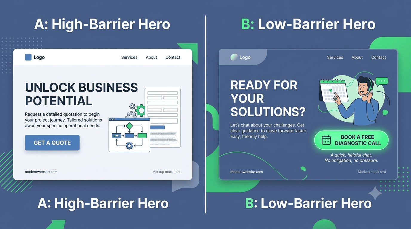
The Button That Scares Away Buyers
Your homepage has a big, orange button that says "Get a Quote." It seems like a good call-to-action. It is direct. It is action-oriented. But to a first-time visitor who is still researching and not ready to commit, that button feels like walking into a car dealership and immediately being asked "So, which one are you buying today?"
"Get a Quote" implies a high level of commitment. The prospect must be ready to share project details, engage in a pricing conversation, and possibly face sales pressure. Many will bounce instead. You need a softer, lower-commitment CTA that still moves them forward.
"Get a Quote"
- Demands project details immediately
- Implies a sales call is coming
- High perceived risk for the buyer
- Drives early-stage visitors away
- Low click-through rate
"Book a Free Diagnostic"
- Asks for a small time commitment
- Promises value with no obligation
- Low risk, easy to say yes to
- Captures early-stage interest
- Higher click-through and conversion
The commitment continuum
Different visitors are at different stages of readiness. Your CTA should match their stage.
Just Browsing
No commitment. Just exploration. They want to see if you look legit.
"See Our Work"Curious, Comparing
They give an email, you give value. Lead capture without sales pressure.
"Download Case Studies"Serious, Evaluating
A specific, time-bound, no-cost consultation. Low risk.
"Book a Free 20-Min Call"Ready to Buy
Now the high-commitment CTA is appropriate. They have already been nurtured.
"Request a Quote"The best soft CTAs for Kenyan B2B
Replace "Get a Quote" with one of these, depending on your primary service.
- "Book a Free Diagnostic Call" For consultants, lawyers, architects, accountants.
- "See Our Work & Pricing Guide" For contractors, designers, agencies. A downloadable PDF with indicative pricing.
- "Talk to a Specialist" A WhatsApp chat link or a call booking. Human and low-friction.
- "Get a Free Website Audit" A value-first CTA that demonstrates expertise without asking for anything upfront.
How to frame the soft CTA
The language around the button matters as much as the button itself. Add a small line of reassurance beneath the button to remove the fear of being "sold to."
The data
A Nairobi management consultant changed their primary homepage CTA from "Get a Quote" to "Book a Free 20-Minute Diagnostic." The shift in visitor behavior was immediate.
Lower Friction, Higher Returns
The lower-commitment ask attracted more prospects into the funnel, where the consultant's expertise could then convert them. The soft CTA opened the door to a conversation, rather than demanding a transaction on the first click.
Do not ask for the sale on the first click. A first-time visitor is not ready to buy; they are ready to evaluate.
Offer value. Build trust. Then close.
Ready to fix your call-to-action?
Stonehenge Digital builds organisational websites with strategic, multi-stage CTAs that guide visitors from curiosity to commitment, without scaring them away.
Optimise My CTAs →Interested in Portfolio & Organisational Website?
Let's build this for your business
A professional, mobile-first website that makes your business look credible and gets found on Google.